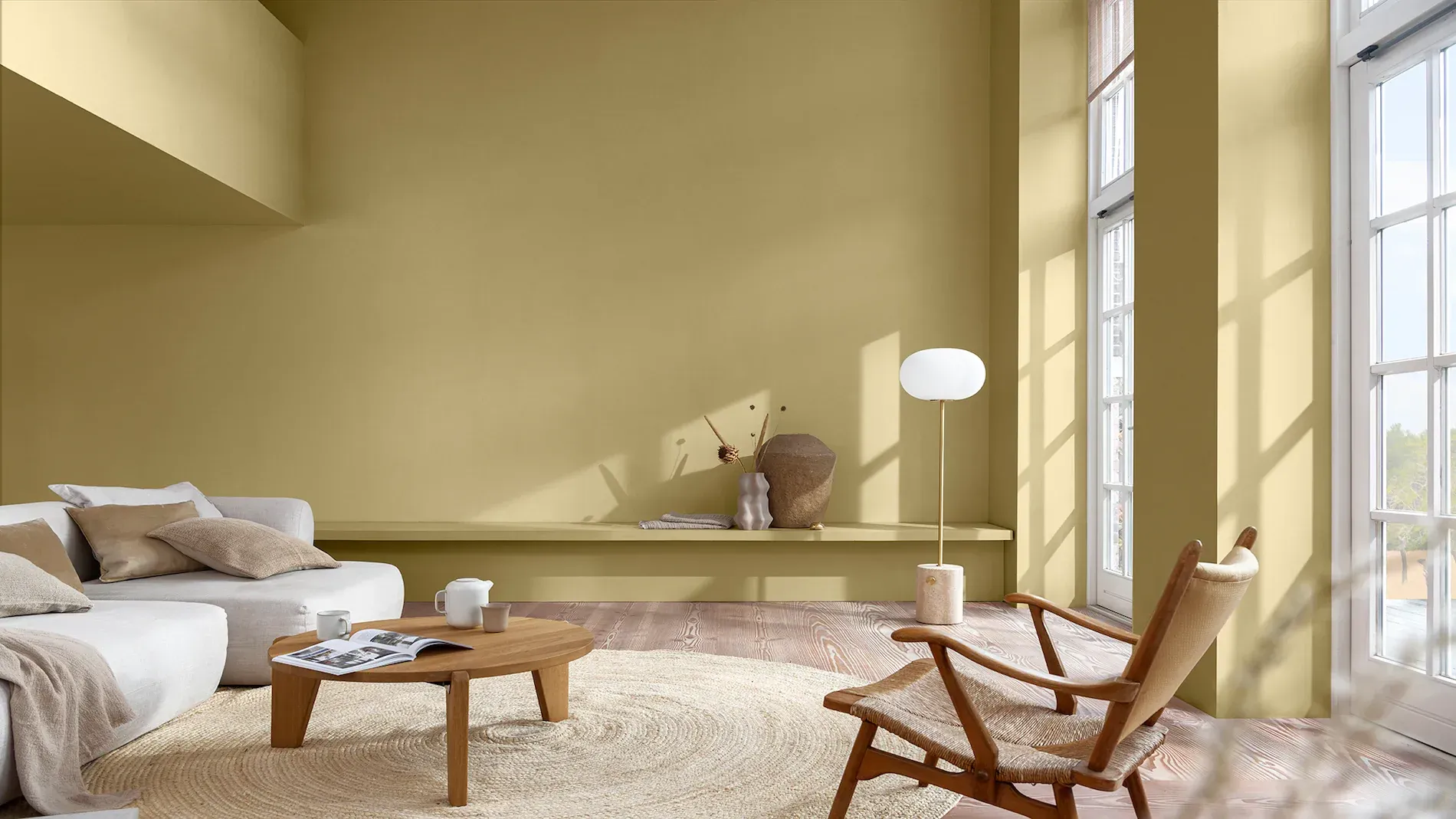
Tapping into creativity can be energizing, consoling and joyful, and we all need a space where we can feel inspired to listen to music, to read a book, to dream. The Studio palette can provide the ultimate soothing backdrop with its soft pastel colours: warm shades that work perfectly alongside the cool fresh tones of Bright Skies™.
Whether you choose to paint a feature wall or experiment with one of our creative paint techniques, these are colours that simply look good together and can refresh any space in your home – from the largest living room to the smallest nook.
Take a look at our ideas for combining Studio colours all around the house and feel inspired…
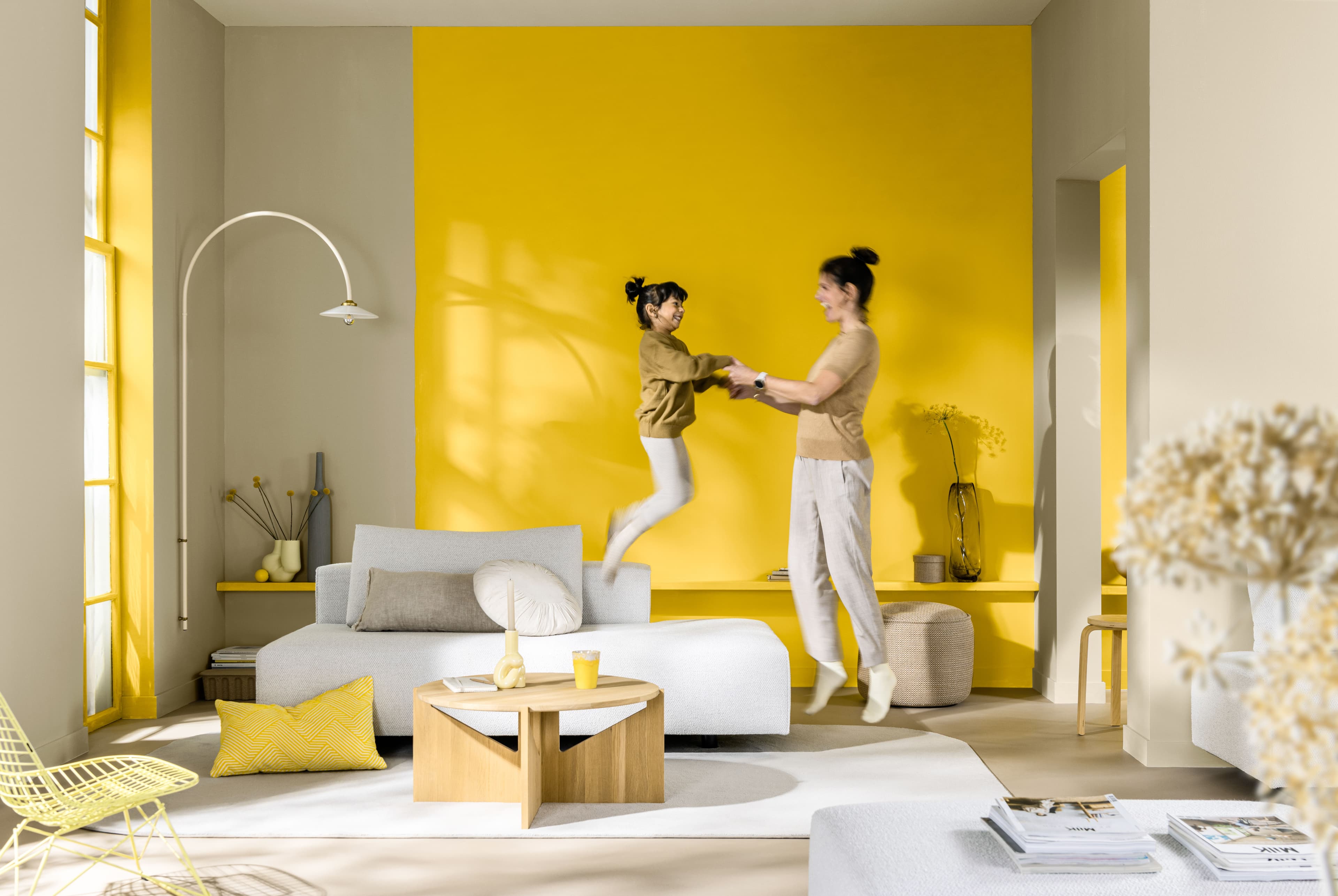
1. Zone a seating area
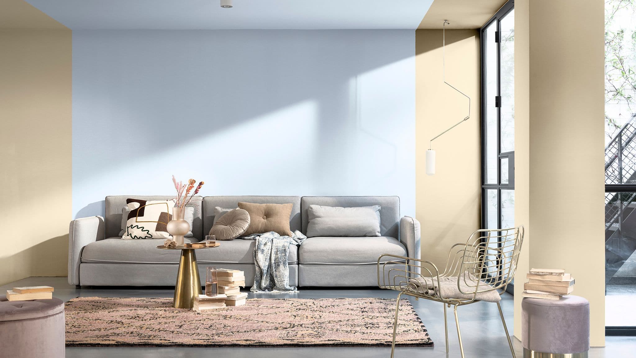
Rather than painting an edge-to-edge feature wall, using a wide panel of paint is a great way to frame your furniture. Here a strip of Bright Skies™, Coral & Dulux Colour of the Year 2022, is continued onto the ceiling for a wraparound look with a modern, fresh feel. With the remaining walls painted in a natural neutral, the result is bright, airy and inspiring.
Which colours?
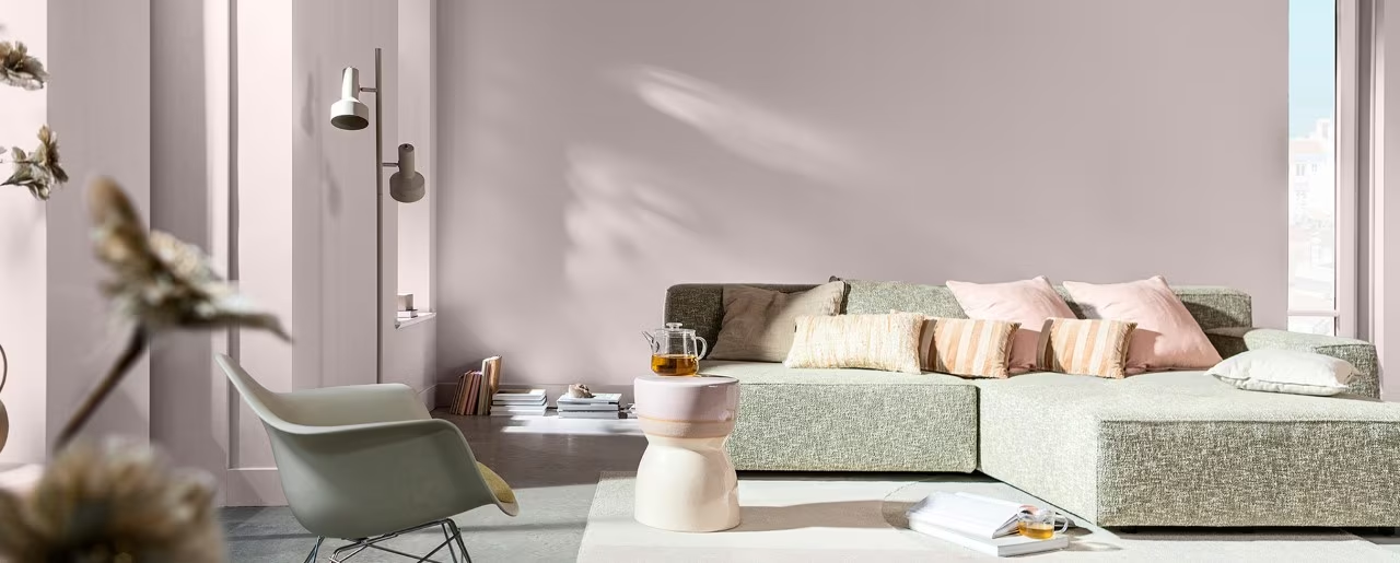
2. Create the ultimate bedroom escape
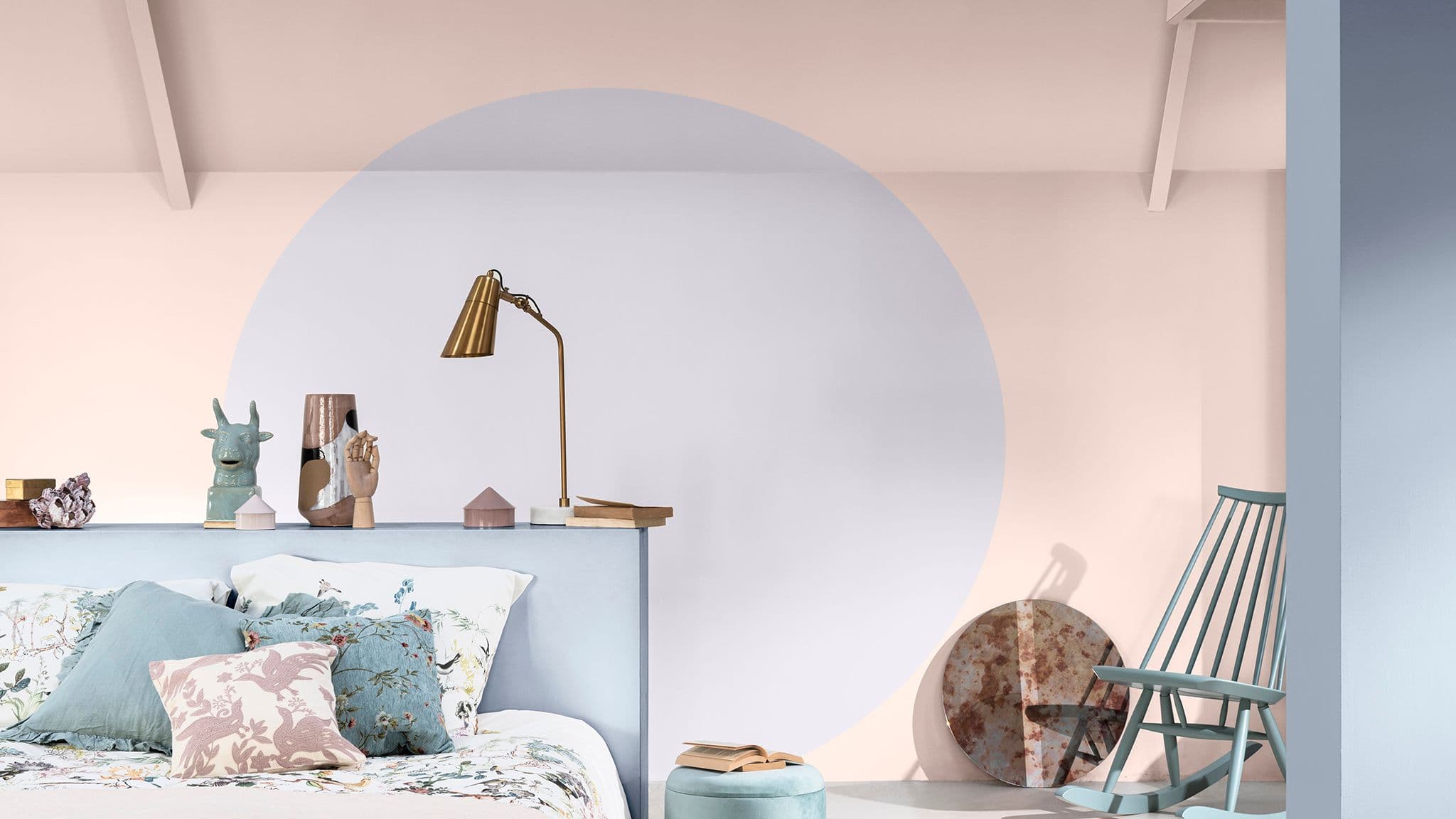
Soft, soothing and a little bit glamorous, Studio colours work brilliantly in a bedroom. Create a book nook or a place to curl up at the end of the day by breaking up a sweep of wall with a painted circle in a different complementary tone. Pale pink and lilac, framed with the airy tones of Bright Skies™, creates a gentle scheme that is both sophisticated and relaxing.
Which colours?
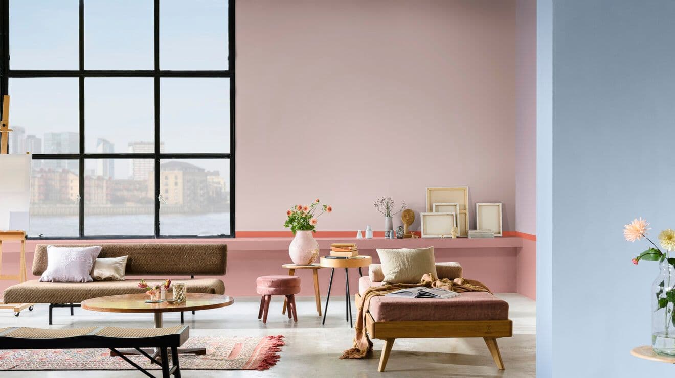
3. Add warmth to a hallway
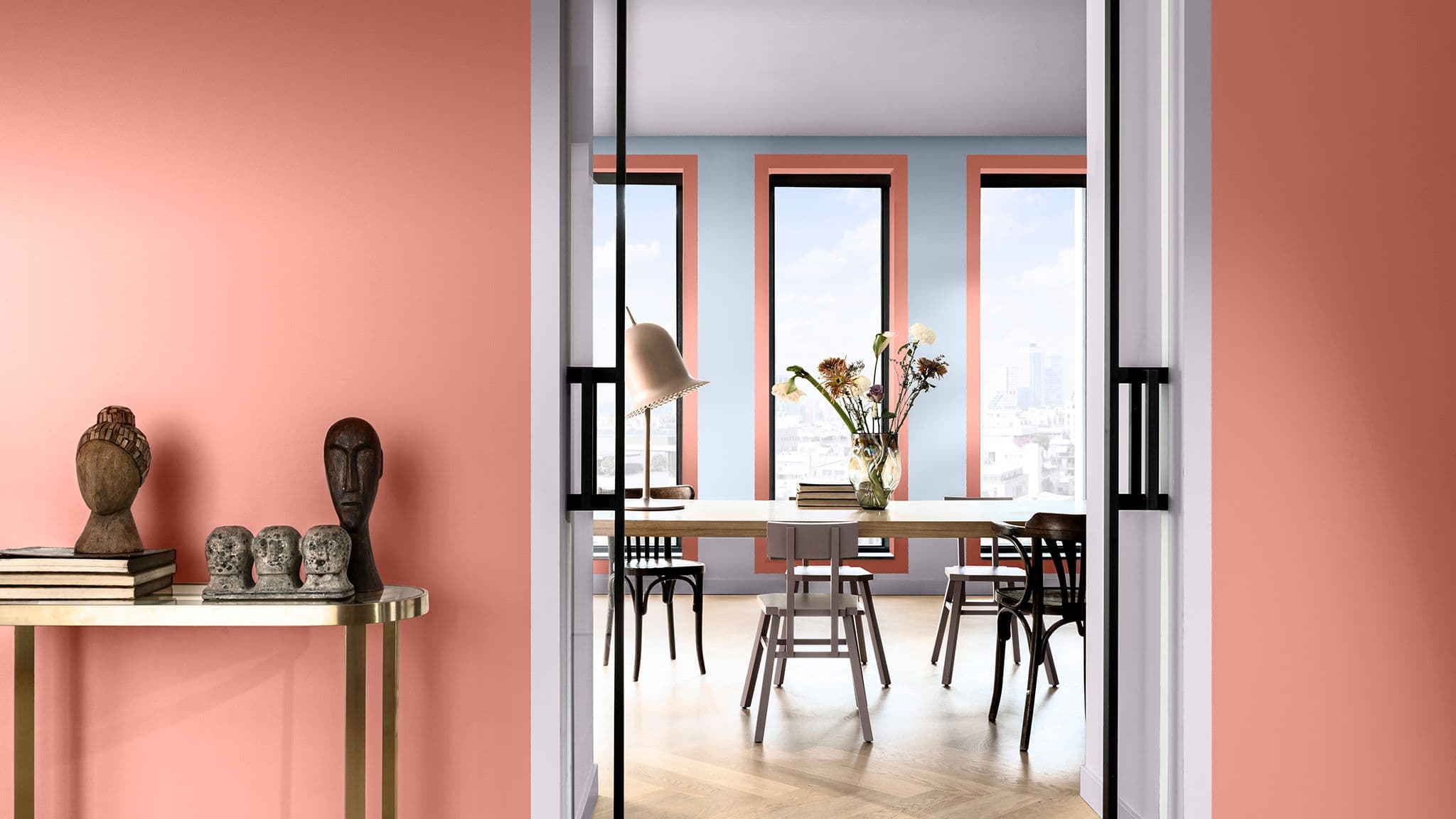
There’s lots of flexibility when it comes to using Studio colours and Coral & Dulux Colour of the Year 2022, Bright Skies™, because they work so well together. In a large space, add warmth with a deep pink tone set against a pale border. And think about the whole space, not just one room. Adding details of the same colour in the adjoining area will help the whole scheme hang together.
Which colours?
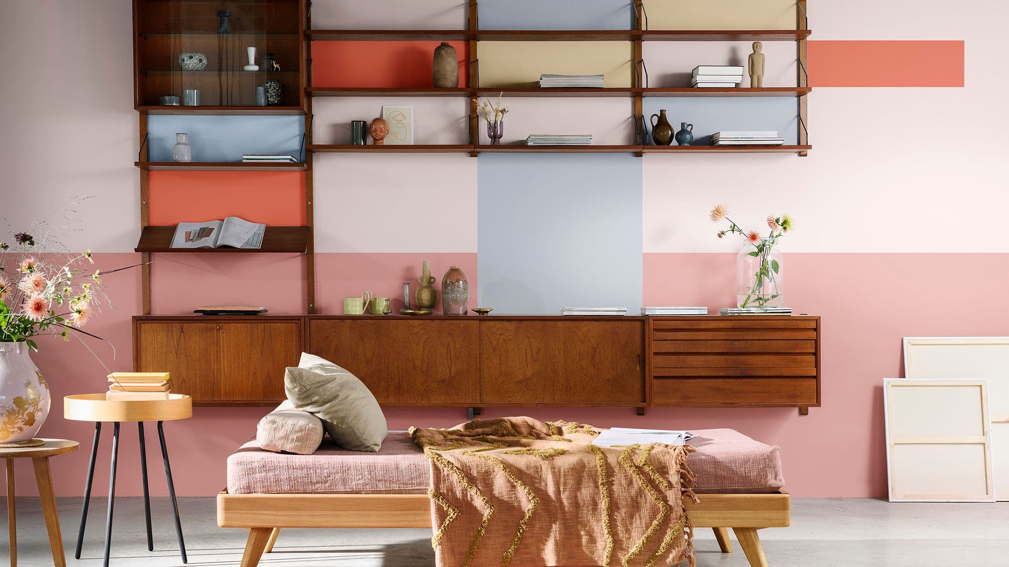
4. Make a statement with paint
What better way to add colour and character to your home than with a patchwork of colour behind open shelving? Coordinating shades from the Studio palette are ideal for a vibrant backdrop that’s inspiring and inventive. Simply mix and match blocks of colour in a selection of your favourite Studio tones, alongside light and airy Bright Skies™.
